

 32.
Escola Superior de Educacao em Setubal (site plan)
 33.
Escola Superior de Educacao em Setubal (plans)
 34.
Escola Superior de Educacao em Setubal (view)
 35.
Escola Superior de Educacao em Setubal (view)
|
It is possible to trace these themes through many projects.
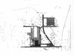
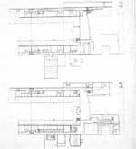
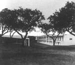
In the Escola Superior de Educacao in Setubal (figures 3235), the three-sided
courtyard opens to an undulating landscape that rolls into its arms. Distinct
from the University of Virginia example that ought to come to mind, the
project does not so much classically frame a landscape beyond its orderly
tranquility as much as prompt this very landscape to wash right into its
midst. The sequence from the parking lot or from the road running along
the building's opposite flank leads to one of the legs of this project's
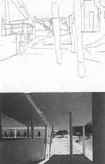
open courtyard  that is longer than the other. To signal its peculiar role within the typological
context, as the initiation of an entry sequence along this leg back to
the building's principal vestibule on center at the base of the courtyard,
the columns kneelthat is, inclineand the roof drops down as if in the
gesture of a canopy. Ramps link the various elevations of ground brought
together at this surprising moment. Within, a pattern of circulation that
hints at the latent symmetry of the project unfolds as a series of unique
events out of kilter with the "proper" order of the plan, as if to highlight
the contrast between promenade and purported order.
The oddity of the paths to the building, traversing along the rolling
grassy landscape from one side, or through an apparently casual closed
patio placed at an angle to the long leg of the building, make this building
seem to lay unexpectedly upon the ground. Paths unrelated to the logic
of the building bring us to the "wrong" part of the building to initiate
our entry into it. And the internal pattern of circulation carries on to
similar effect. We wander the building as vagabonds about the ruins of
Rome.
|
 36.
Faculdade de Arquitectura (site plan)
 37.
Faculdade de Arquitectura (plan)
 38.
Faculdade de Arquitectura (perspective)
 39.
Faculdade de Arquitectura (view from other side of river)
|
Our trace and mark appear upon the body of Siza's buildings
in other ways. Physiognomic figures in facade patterns lend a strangely
human aspect of gesture to the body of many of Siza's buildings. In the
totemic boxes of the Faculty of Architecture studio buildings (19861993;
figures 3639), different "characters" are detectable, one with close-set
eyes, one glancing west, and one, a Cyclops, looking ahead. The skylights
of the eastern-most studio seem like a creature from John Hejduk's architectural
bestiary. Yet all these gestures are not so surprising; they, like the
optical cut in the Carlos Siza house, inscribe within the body of the architecture
the roving subject's perceptual experiences. These windows through which
we see represent that act of seeing in a rhetorical gesture. Behind, a
ramp rises along the face  of the classroom and lecture hall building, and the gliding glance that
peers out during the ramp's ascent is cut from the building's facethe
slope of the roof suggests the ramp inside but is steeper, making the cut
of the ribbon window, which follows the angle of the ramp, more palpable
as a gash in the facadethat is, the cut is not "explained" in relation
to the building's sloped profile.
It bears noting that the gateway pairing at the west-end entrance to
the Faculty's campus is contradicted by the change in section that runs
along the axis that they establish. Entrance is made through a flared vestibule
stuck into the face of this sectional change, or up a flight of crossing
stairs and into the bottom of the ramp's figure. The markings of path about
the building and the anthropomorphisms play similar roles, leaving a trail
of marks on the building, suggesting an order of movement and perception
overlaid onto the more stable order of forms. The project is set on a steeply
inclined bank of the Douro River; the split in section is in fact related
to a mosaiclike pattern of platforms into which the embankment is cut.
Thus its disruptive role is, again, the superposition of the nonconforming
patterns of site and architectural configuration. |
![]()


![]()