![]()


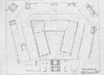
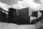
The building has no base but for a thin black line of tile set flush in the white wall, nor is the ground in any way specially prepared for the building. It is significant that the building's figure, on one side and at the back, is caught up in the geometrical organization of the ground plane, but there is no sense of accommodation at the point of contact between building and ground: at the short end of its arms and along the side of the far arm the building sets right down into grass as if it were a model or play object set down upon a living-room carpet.
Perhaps habitual percourses around the edge of the garden drove the
logic of a corner entry, now hidden and far from everything else in the
garden. The inherited order of the object is treated with the kind of indifference
that we might imagine in reinhabiting a ruin, or building the new city
around it, as happens in Rome. New windows and doors are cut into an ancient
edifice, new street patterns are laid out with no necessary regard for
its original order or hierarchy or organization. It is as if the building
were a piece of nature to be colonized. I exaggerate to make my point,
because clearly each decision of dimension, shape, and location has been
considered. But the cumulative rhetorical effect seems to suggest these
purposeful contrasts and superimposed counterorders. The building is in
many ways, like the pool at Leca, ![]() calibrated to its site, yet that calibration feels more like an exploration
of how disparate things may be set together, existing simultaneously yet
disturbing one another as little as possible. So here now is the found
object of the Pavilion; the grass might as well pass right under it. A
promenade wends its way around the garden, momentarily leaving hidden this
built visitation to the site, and there, in the intimacy of the garden
corner, we enter the building. The entry provokes a local eruption in the
fabric of the building and an entirely localized figurative event occurs,
as if marking the type with an event of human passage, as the stairs, ramps,
or other such materials had occurred against the background of the columnar
grid in Villa Stein or Villa Savoye. The type then becomes a kind of ideal
background for a human promenade, as occurred in Le Corbusier's work against
the background of the space idealized by the columnar order.
calibrated to its site, yet that calibration feels more like an exploration
of how disparate things may be set together, existing simultaneously yet
disturbing one another as little as possible. So here now is the found
object of the Pavilion; the grass might as well pass right under it. A
promenade wends its way around the garden, momentarily leaving hidden this
built visitation to the site, and there, in the intimacy of the garden
corner, we enter the building. The entry provokes a local eruption in the
fabric of the building and an entirely localized figurative event occurs,
as if marking the type with an event of human passage, as the stairs, ramps,
or other such materials had occurred against the background of the columnar
grid in Villa Stein or Villa Savoye. The type then becomes a kind of ideal
background for a human promenade, as occurred in Le Corbusier's work against
the background of the space idealized by the columnar order.


A third event of an entirely different sort is superimposed upon the
superimposition of site and type. An optical cone of vision is cut from
the center of the dining room window, twisting the geometry of two columns;
dimensioning along its trajectory the two opposite windows of the courtyard;
aligning, along radials drawn from the cone's vertex, the dividing walls
of three bedrooms; and popping out from the far side of the house a little
bay window of sorts. Vision is inscribed as another uncoordinated order
into the fabric of the building. The indifference of one order's logic
to that of another suggests the independence of each. The rhetorically
aleatory nature of their relationships suggests the foreignness of one to
the otherthat is, they constitute an archeology of architecture,
represented by typological formations or as in Leca, with syntactical strategies,
site, and the order of the subject. Each is intimately bound to the other,
yet alien.![]()